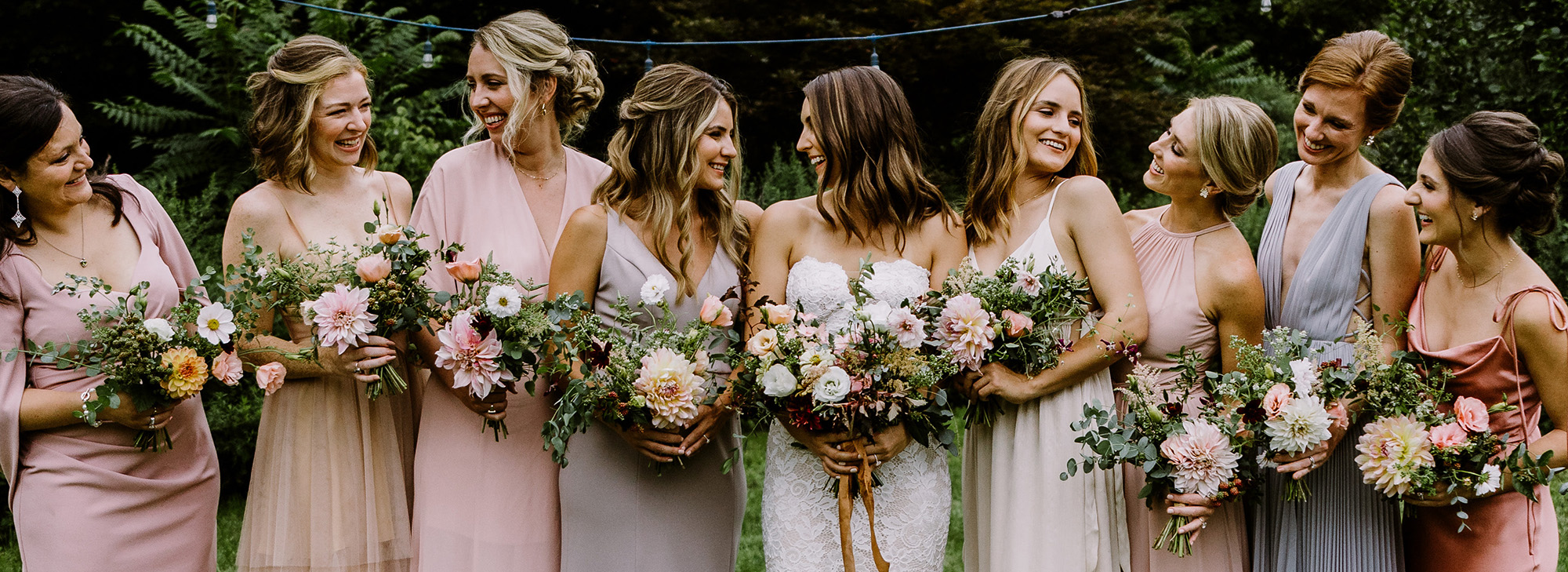
There are so many sources of inspiration for a floral color palette. We can be inspired by a certain flower, a color, a feeling, or even a song!
Most often, though, inspiration comes to me in the form of a photo.
Building a Palette Based on a Photo
In our image-driven world, wedding clients often come to us with a photo from pinterest or instagram that they fell in love with.
It’s our job as designers to take this inspiration and translate it into an original design. To do that, we first need to build the right color palette.
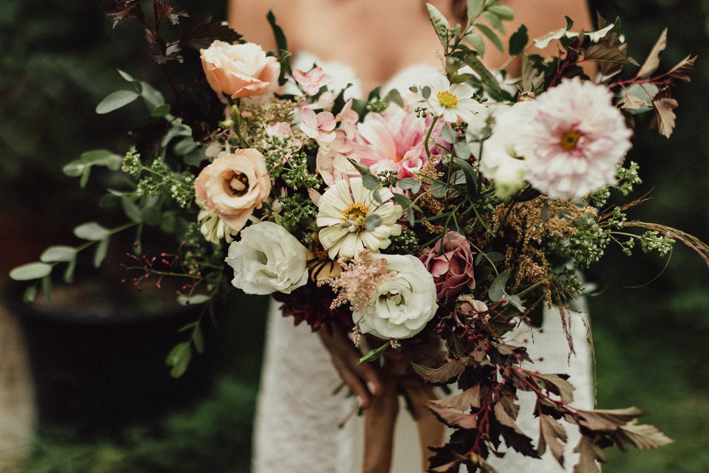
Here is an actual inspiration photo from one of our actual wedding clients! She loved the bouquet in this photo, and it was the only photo she’d found that captured her floral vision.
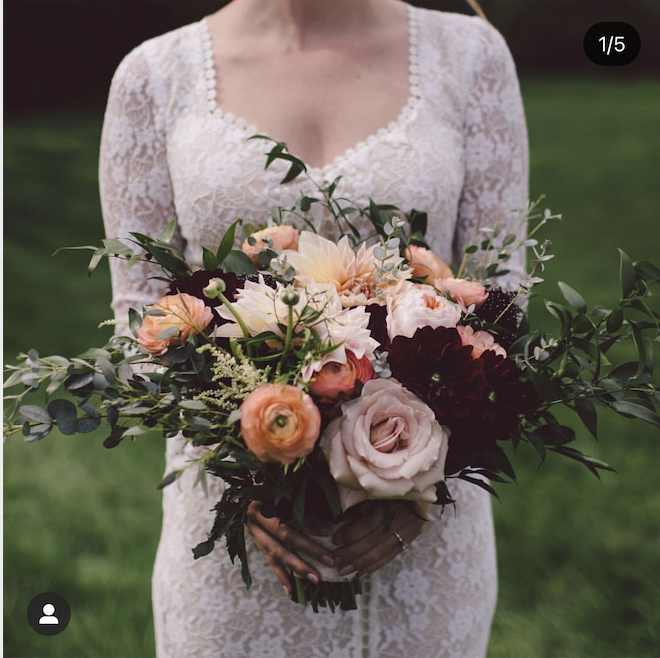
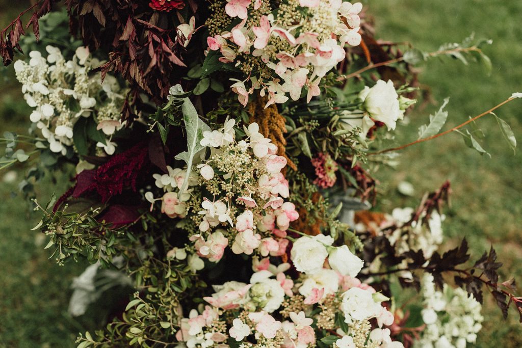
Let me start by breaking down the flowers I see in this bouquet: peach ranunculus, blush roses, white astilbe, cafe au lait dahlias, dark dahlias, and “Black Knight” scabiosa. I’m also seeing ruscus and eucalyptus as foliage. It’s a lovely bouquet!
A more traditional florist, who orders imported flowers, could look at this inspiration photo and order the exact flowers in it. They could probably replicate the bouquet in this photo pretty closely! But, the materials they use would likely not be in-season or local.
We use 100% locally-grown flowers in our work, so we need to be able to capture the style and feeling of this bouquet and embody those with seasonal flowers.
The bride who sent me this photo was getting married in August. In August in NY, ranunculus and astilbe are likely unavailable, and roses are not always a sure bet. Ruscus also isn’t a foliage grown locally, that I know of.
What to do? Build a color palette based on this photo that captures the essence of the arrangement! We can then use our palette to guide our choices of in-season flowers for this client.
Isolating Colors from The Photo
To make a color palette based on this photo, we first need to identify and isolate the colors that appear in the pictured bouquet.
Some people have an easier time doing this naturally than others. If you have trouble seeing past the shapes and textures in the photo to isolate the colors, you can try manipulating the photo to make this easier.
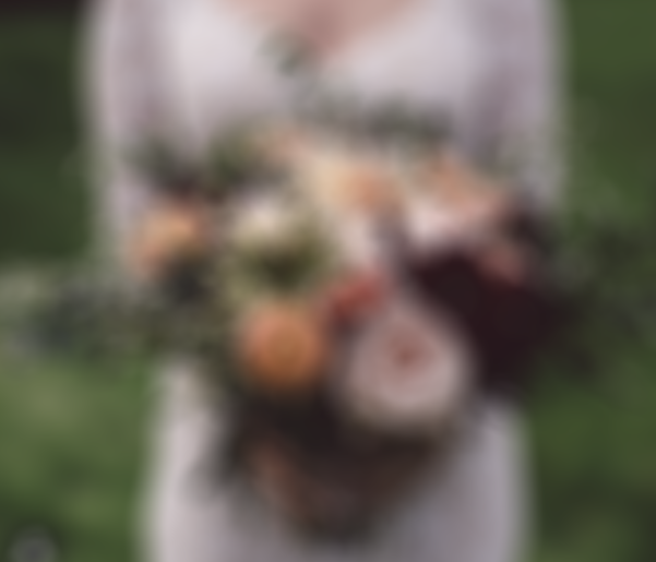
Above, I’ve manipulated the photo using photoshop. I blurred the photo, to make the colors in the arrangement appear more like blobs than flowers. You can blur photos on this website, or with your eyes by kind of squinting at them!
On the right, I put the photo through a photoshop filter that pixelated it, allowing me to see individual colors very clearly, though they may not be super accurate. You can pixelate photos on this website.
You can also upload your inspiration photo to this color-picker website. The website will allow you to mouse over the image as if you were holding a magnifying glass, showing you the colors of the individual pixels. If you have perfectionist tendencies, like me, this can be very satisfying!
Our Final Palette
Here’s the color palette I designed based on this bride’s inspiration photo:

This palette captures the peachy colors from the ranunculus, cream and white tones from the Cafe au Lait dahlias, blush from that big ol’ rose, and dark burgundy from the scabiosa and dark dahlias.
I always include a few tones of green in my color palettes as well, unless we aren’t planning to use any foliage. Green is a color, too! And there are about a bajillion different shades of green, which all have different feelings.
Giving Colors Weight in the Palette
I like using bar-style color palettes, because they show the relative proportions of the colors in the palette.
This bride told me that she wanted a light and airy feeling to the palette, and that she especially loved those Cafe au Lait dahlias in the photo. So, I gave extra prominence to neutral creams and whites. These colors take up more space in our palette, even though they don’t dominate the inspiration photo.
Consider the following bar, which contains the same basic colors, but in different proportions. An arrangement made using this palette would feel much darker and pinker!
Words to describe it would be “moody,” “lush,” and maybe “vibrant.” Great vibes, but not the “light and airy,” Cafe-au-lait-inspired palette that this client had envisioned.

When you make your palette, start with the colors themselves, but play with their proportions until you get the feeling you’re after.
Planning the Palette with Flowers
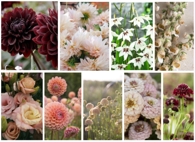
Next, I always make a photo grid of flowers that should be in-season for us in the color palette on the client’s wedding date. Local flowers vary from week to week so this is my best guess, not set in stone!
The flower grid is a really important image. It helps the client to visualize what her flowers might actually look like, and how they might differ from her inspiration photo.
Making the flower grid can also help me crop plan for this wedding, and make sure that we’re growing materials timed appropriately for the event.
Using the Palette
The week of the wedding, we used our color palette as a guide when we harvested flowers from our fields. We selected lisianthus that had more of a buff color, rather than the more saturated pink and peach blooms. We limited our zinnia harvests to the whites and earthy, plum-colored Queen lime series. We found surprises in our field that we hadn’t planned to use for this wedding, but were perfect: talinum, blush-colored cosmos, and delicate flowering oregano.
We also used the color palette to order some fun additions in from other local farms, like hydrangea (blush) and blackberry branches with young fruits (burgundy).
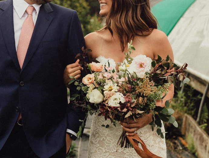
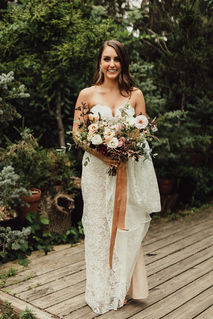
Here’s the final bouquet we made for this bride. She loved it! She actually burst into tears of joy when I presented it to her.
More Color Palette Inspiration
I love thinking about colors! Creating color palettes from images is one of my favorite parts of flower arranging, and if it wasn’t part of my job, I would still do it for fun 😉
Here are some more color palettes based on photos that I personally find very inspiring, from some amazingly talented floral designers.
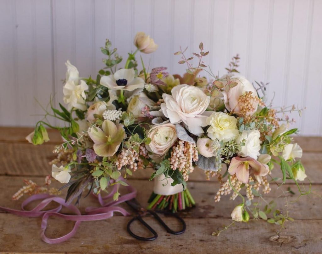

I love this soft spring bouquet by Jennie Love! The little pops of blue foliage in there give it an extra bit of flavor. I also love the golden-brown tones; they are a beautiful way to ground an otherwise light & airy palette. The golden tones also play off the mauve-y purples in a subtle complementary color dance.
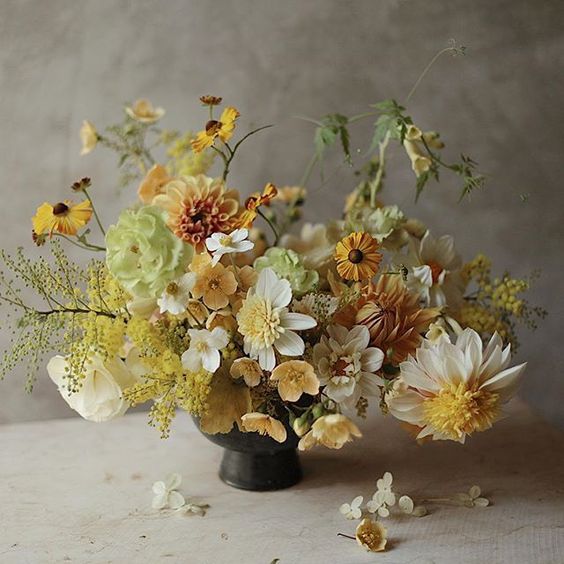

Yellow is an underrated color, in my opinion! I love this yellow-centric compote arrangement by La Musa de las Flores. In my creative interpretation of this photo’s color palette, I’ve added some subtle lavender and smoky pink tones to round out the golden hues. This photo may or may not be the color inspiration for my own wedding… more on that later 😉
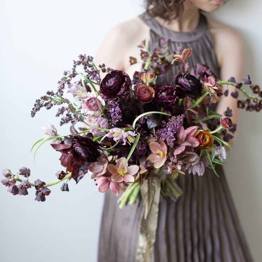

I am waiting for the day when a wedding client asks me for this gorgeous, saturated color palette! This dreamy Sarah Winward bouquet uses a mostly analogous color palette, with the clear emphasis on purple tones. There are a wide range of purples involved here, which give the palette richness and depth. The small pops of peachy-orange enliven the whole arrangement; it’s the delightfully “sour” color in this otherwise sweet palette.
Go Get Inspired!
Try this out for yourself! Find a photo that inspires you and see what kind of fun color palettes emerge from it. Websites like this one make it easy to play with color palettes. I’d love to see what you create.
Computers can auto-generate palettes based on images, too (but they aren’t as good at it as humans!!) You can try a color-bot at this website and see how much better your hand-generated palettes look.
Have fun, flower friends!
Samantha is the owner of Sea Change Farm & Flower.
Connect with me!
Sign up for our newsletter here.