
When the Sea Change crew is making bouquets at the farm, we talk a lot about color. It’s a running joke of ours that I don’t like colorful bouquets.
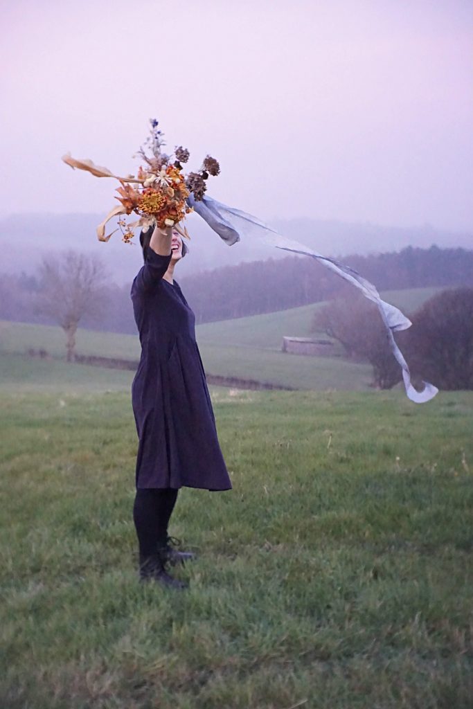
This is not true! I love colors and I love colorful flowers! Evidence:

^ That’s me, loving some colorful flowers.
But, I certain color combinations are “too much” for me. Do you know what I mean?
When left to my own devices, I tend to choose pretty strict color palettes for myself.

So, I’m going to break down how I think about color when I’m working with flowers.
None of these things are hard-and-fast rules. In fact, I’m usually not thinking about following rules at all when I’m choosing colors. Nevertheless, there is theory behind the color combinations that I’m drawn to and the ones that are a bit crazy to look at!
Let me explain my first color strategy to you this week: using complementary colors.
Complementary Colors
Woooooaaahhh color theory words! Remember complementary colors?
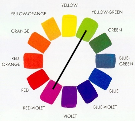
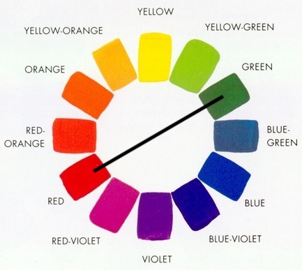
Back up: remember the color wheel? Let’s go back to 3rd grade art class.
The color wheel contains all the colors that the human eye can see, in a simplified and organized form. The primary colors–Red, Yellow, Blue–make up the foundation of the wheel.
In between each set of primary colors are the secondary colors formed by mixing the two parent primaries: Orange, Green, and Purple. And in between each adjacent primary-secondary pair is the tertiary color that you would get by mixing those two colors. The tertiary colors are Blue-Green, Red-Orange, etc.

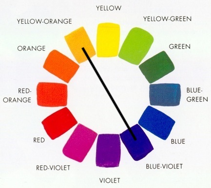
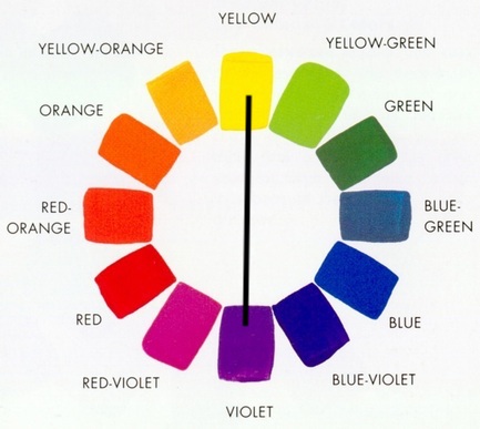
Complementary colors are colors that are opposite from each other on the color wheel. For whatever reason (science!), these color combinations are almost guaranteed to be pleasing to the eye.
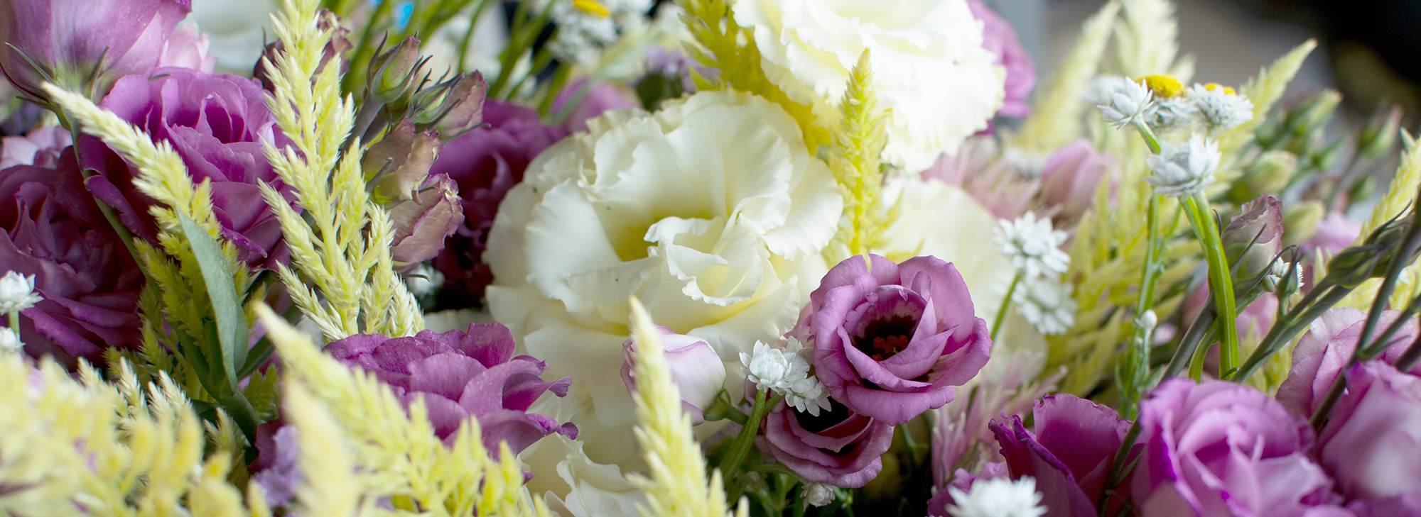
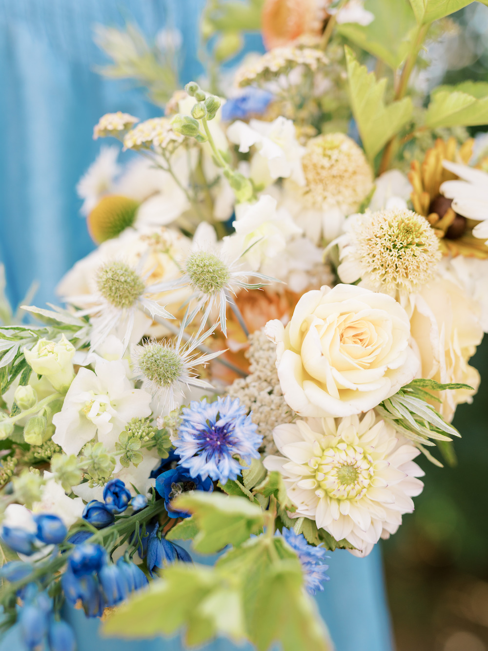
As an example, let’s look at a pairing of Red-Violet and Yellow-Green.
I used this color pairing to design our mixed bouquets this week. Can you see those two anchor colors in them?

When we were harvesting flowers for these bouquets, I wasn’t thinking about complementary colors. I was thinking about how the lime green celosia in our field looked beautiful and ready to harvest. And then I looked over at the vibrant scarlet lisianthus and thought they would look nice together.
It’s no wonder they look nice together: they’re complementary colors.


With the Red-Violet lisianthus and the Yellow-Green celosia there to anchor the color palette, I filled in the bouquets with other flowers that were close in color to these anchor flowers, like pink asters, purple statice, pale gold lisianthus, and small yellow ammobium flowers.
This is a very bright, colorful, loud palette! But it doesn’t feel like “too much” to look at, because the colors are linked by this underlying relationship.


I use complementary colors so often and reflexively in my floral work that it’s often only after I make something and look at it that I realize there is a complementary color pairing anchoring it.


Complementary colors: they are everywhere! You can probably see some good complementary color pairings from wherever you’re sitting reading this.
But, that’s not the whole color story, and it’s not the only way to design floral color palettes. Next time, we will dive into the subtle, rich, and beautiful world of analogous colors. Stay tuned 😉
This is an excerpt from the Sea Change Farm newsletter.
Want more like this? Sign up for our newsletter here.